
Simple is best, especially for the folks unexperienced in designing. The first instinct would be to fill up an empty space which will, most likely, result in overcrowded design with more messages then needed in one ad. Going for a simple design is the safest and most foolproof approach to designing great ads.
Using Fonts
You probably don’t need the largest and most out-there font for your ad to make an impact. In case of accenting a catchphrase, you can, for sure, go crazy with your font but keep it to one crazy font per design.
Generally speaking one to two fonts per design is more than sufficient to get your point across. There is so much you can do with just one font: different styles and sizes of one font family…
Using color and negative space
A design can be cheery and colorful without being childish if it isn't supposed to be for children. It is best to avoid using too many colors in one design. Color combination plays a major role in the way an ad makes an audience feel and the way they perceive it, besides the obvious, the way an ad actually looks.
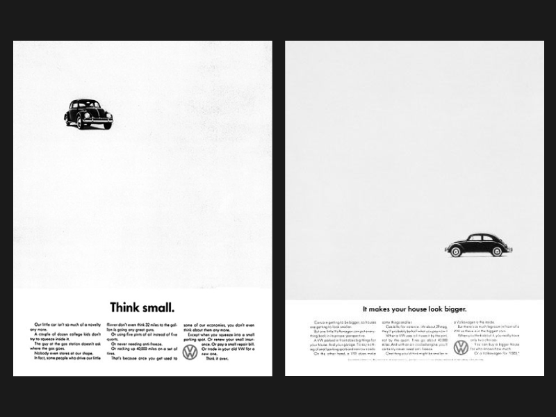
Closely related to the choice of color is the lack of it, the lack of everything. As previously stated the urge to fill up a space is real and we as marketers and designers need to fight it. Empty space on the design is needed. Empty/white/negative space can be any color as long as the color is neutral for the design itself. Call to action will surely stand out more on the white background than on a patterned and crazy one.
Image by DDB
Contrast between the color choices, size of elements, positive and negative space is of great importance. Contrast helps us understand the hierarchy of elements we see on design and the order we see them at.
Communicating a message
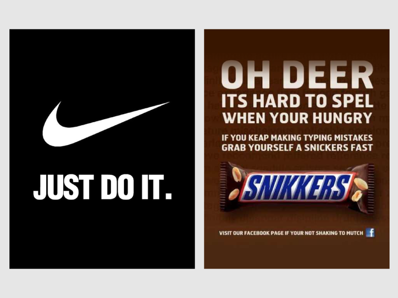
Possibly one of the best design advice is to be readable first! It is rather pointless to communicate everything one wants to communicate if an ad can't handle it! If, for example, an ad format is too small, few words are all you need and all you can have. There is nothing worse than a sentence you can't possibly read taking up precious space that could have been used more purposefully. Having nothing filling the space is better than an unreadable sentence. Communication has failed if the only person who knows what is written is the person who wrote it.
Be mindful of the use of designs created. Make sure that the design is applicable on different platforms and different sizes and ratios. Consistent looking ads across multiple platforms will surely look harmonious and purposeful which, in a long run, may help with the brand's image in the eye of its consumers.
Finally, hire a designer! Everybody with a little feel for design can make something useful and okay-looking but it takes a lot of precious time and a lot of effort. While it is true that with some feel for design and a bit of luck you could possibly make something good, but nobody unexperienced can make a great ad every time, it is not as simple as it seems. Don't take your chances, don't waste your precious time- hire a designer for a designer's job.
Read here more about why you should integrate a graphic design into your marketing campaigns!